
Matched to the app
The same colours, fonts and shapes as the application, so there’s no break when moving from the website into the app.
Case study
The product website of a web application built for accounting firms, matched to the app’s look, with a trial sign-up that delivers a usable trial office within minutes.
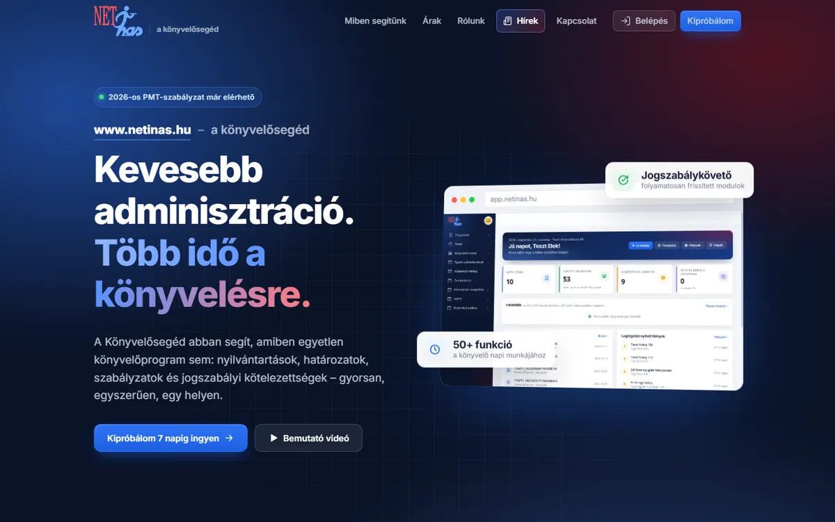
The product’s old website was outdated and looked different from the application itself. Prospects needed manual handling to get a trial.
The goal was a site that shares the application’s visual language and gets prospects to a trial in as few steps as possible.
The solution
The same colours, fonts and shapes as the application, so there’s no break when moving from the website into the app.
Enter name, email and company, receive a code by email, choose a password — and the application creates the trial office automatically.
News appears on a separate page and can be extended through a simple editing interface.
Transparent pricing, a demo video and screenshots of the real interface.
The contact and order forms work with multi-layer spam filtering.
The old site’s URLs redirect to the new pages, so old links aren’t lost.
Prospects get from the website straight to a working trial office without any human involvement, and the trial closes itself at the end of the trial period.
The website and the application present a unified image, which also strengthens the product’s credibility.
Next step
Write a few lines about your goal and what you already have. After a short conversation we’ll send you a detailed quote.